Join Jeff, Peter, Daniel, Sharyn, Victoria and Jenn at the Metals Investor Forum May 8-9!
-Jeff Clark, TheGoldAdvisor.com
I’ve seen many charts over the years. Most are interesting, but to really grab my attention requires something exceptional.
It’s got to be compelling, of course, but what makes the most gripping chart for me is this: something that could directly affect my life or my investments. One that makes me ponder it long after I first saw it.
This is one of those charts.
That’s because if it plays out as it’s currently unfolding, it has huge ramifications for us, both as consumers and investors.
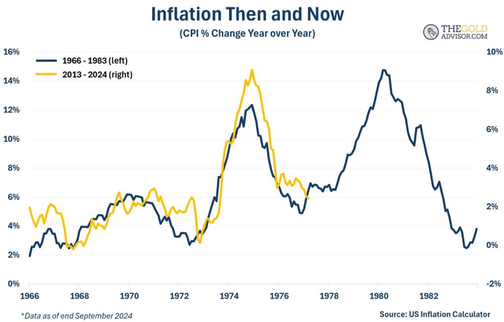
This chart shows the path of the CPI from 1966 through 1983 (black line). The gold line tracks the CPI from 2013 to today.
The correlation is eerie. They basically have followed the same pattern for the past 12 years.

The path of the CPI today is very similar to the path of the CPI back then. The correlation is over 90%.
Also notice there were multiple jumps of prices in the older CPI. And each spike was higher than the one before, until it got under control. If we were to track what happened back then, it’s not hard to see we could be headed for much higher prices today.
Why might this happen?
It’s Not the CPI, Stupid
Higher prices—measured by the dubious CPI—are the result of inflation, not inflation itself. The CPI tracks prices after true inflation has occurred.
To quote the famous line from economist Milton Friedman, “Inflation is always and everywhere a monetary phenomenon.”
Meaning that inflation, by definition, refers to money that loses its purchasing power. That’s what makes it a monetary phenomenon. Friedman argued you could not find inflation anywhere in the world that was not caused by a prior increase in the supply of money or in the growth rate of the supply of money.
So, has there been a prior increase in the money supply?
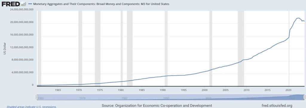
One of the broadest measures of money supply is M3, because it emphasizes monies used for savings (they would say as a store of value), rather than just a medium of exchange (it includes M2 plus large time deposits in banks).
Here’s M3 since 1960.

Never before seen in history, M3 grew at a torrid pace, rising 40.47% from February 2020 through July 2022 (29 months).
This is inflation, the result of which is higher prices.
You might claim that since M3 has come down from the 2022 peak we’re fine now. But it’s only down 4.3%, still far above where it was before Covid. If M3 had returned to pre-Covid levels, or at least close, I might conclude that higher prices are unlikely. But that’s not the case.
Ergo, there is still a lot of currency sloshing through the system.
Are Higher Prices Really Ahead—Again?!
I like how JPMorgan analysts have portrayed what’s ahead.
They say we’ve now entered the “debasement trade”, what is essentially a weakening of the currency. If they’re right, then yes, we’ll get higher prices.
The “trade” part of their term refers to an investment strategy that “thrives when currency values decline, often due to inflation or heavy government spending.” History shows government deficits—spending more than revenue—are one of the leading causes of true inflation.
In that case, investors should choose assets that hold or even increase in worth when currencies lose purchasing power, ones that are a store of value. This obviously starts with gold. You might think a CD would be better, but what happens to the value of the currency in your CD while you’re locked in?
Is a debasement trade likely to play out? That seems likely, due to:
And let’s not forget about the ever-growing US national debt, now $36 trillion. And get this: the government spent $584 billion in October alone, an incredible 79% more than it took in receipts that month! This isn’t a free ride, even if it’s taking longer to resolve than many of us thought.
Higher prices seem more likely than not. If so, the “scariest chart” just might get scarier.
The gold price would increase in this scenario, maybe even spike. Mining stocks would do even better. I invite you to follow along with us, as we analyze—for free—the gold and silver stocks we personally own, ones we believe we outperform the industry averages. Sign up here in less than a minute to see our full portfolio.